NORWEGIAN
TECH START-UP
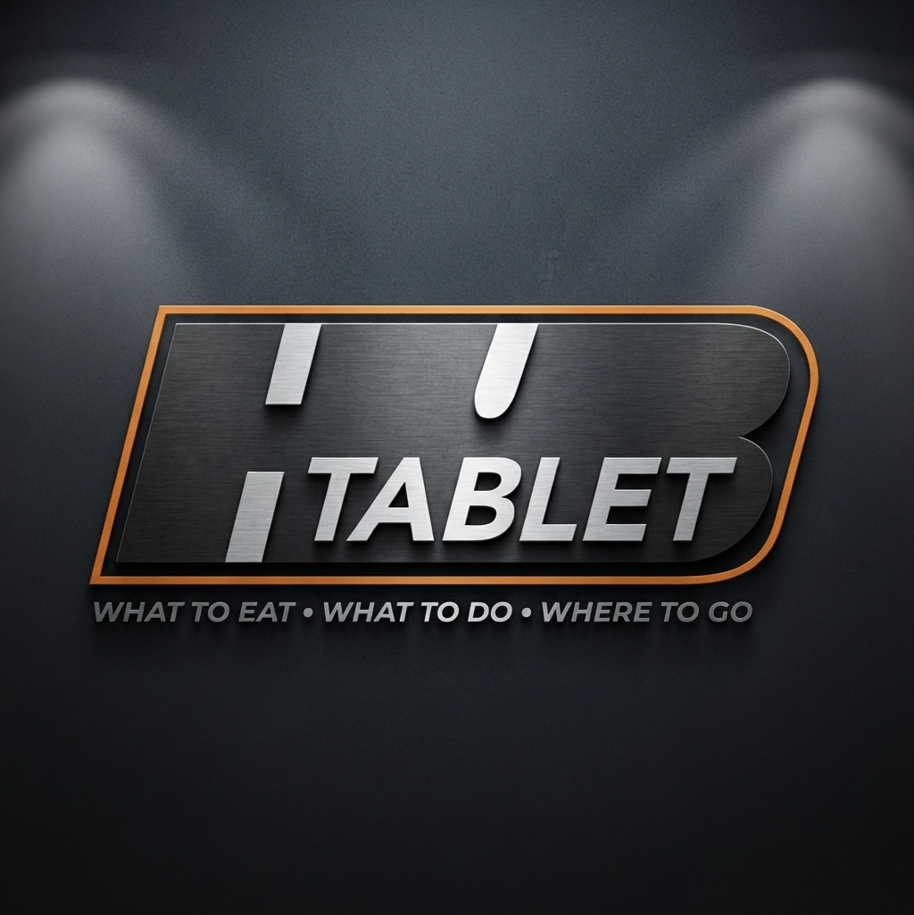
A Norwegian tech start-up looking for a solid, clean visual identity. The aim was to build trust and fit in with the hotel industry, where hotel guests will use the HUB Tablet. The color foundations are warm grey and orange. Because the company is based in Norway, the logo and brand also feel at home in current Norwegian marketing culture.